Golden Ridge presented a rare design challenge: how to position a single property for multiple futures at once. More than a real estate listing, the project required a brand-led digital experience capable of communicating land, legacy, and long-term opportunity—while speaking clearly to very different buyer motivations.
This was not a conventional real estate website. Golden Ridge needed to appeal to three distinct buyer profiles, each with different motivations, decision criteria, and emotional drivers:
Land developers evaluating acreage, zoning potential, and long-term ROI
Private buyers seeking a legacy property and estate-level lifestyle
Hospitality or event operators interested in location, views, and experiential potential
At the same time, the property owners wanted:
Speed of sale without sacrificing value
An online presence that felt professional, aspirational, and future-focused
Professional photography and video assets to direct the narrative
The challenge was to design a digital experience that could balance storytelling and strategy, emotion and information, inspiration and practicality — all within a compressed timeline and evolving project constraints.
Rather than treating the site as a static listing, we approached Golden Ridge as a branded destination—one that could frame the land as an investment in opportunity, memory, and experience.
Key strategic decisions included:
Brand-first positioning to filter for qualified buyers through tone, language, and visual quality
Image-led storytelling to communicate the emotional weight and experiential value of the property
Open access to information, avoiding gated content or early lead friction
Buyer-agnostic architecture, allowing different audiences to self-identify and explore relevant content paths
The site was designed to answer a single question clearly and confidently: “What could this property become for the right buyer?”
Golden Ridge is a 37.5-acre estate property located in Brentwood, Tennessee, offering a rare combination of acreage, privacy, and proximity to Nashville. Unlike a typical residential listing, the property presented a unique opportunity: it could function equally well as a private family compound, a development-ready land investment, or a future hospitality and event venue.
The goal of this project was to design a custom digital experience that could attract a highly qualified buyer, communicate the long-term value of the land, and elevate the property beyond the constraints of a traditional MLS listing.
I led the brand, UX, and UI design efforts from early discovery through high-fidelity design and development handoff.
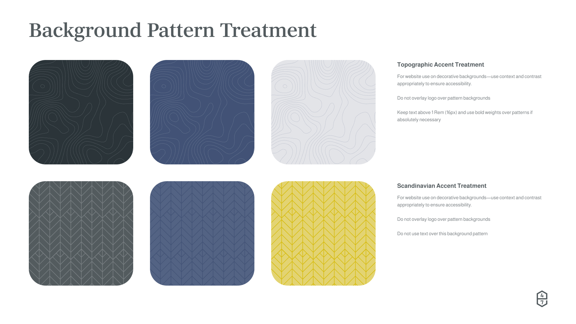
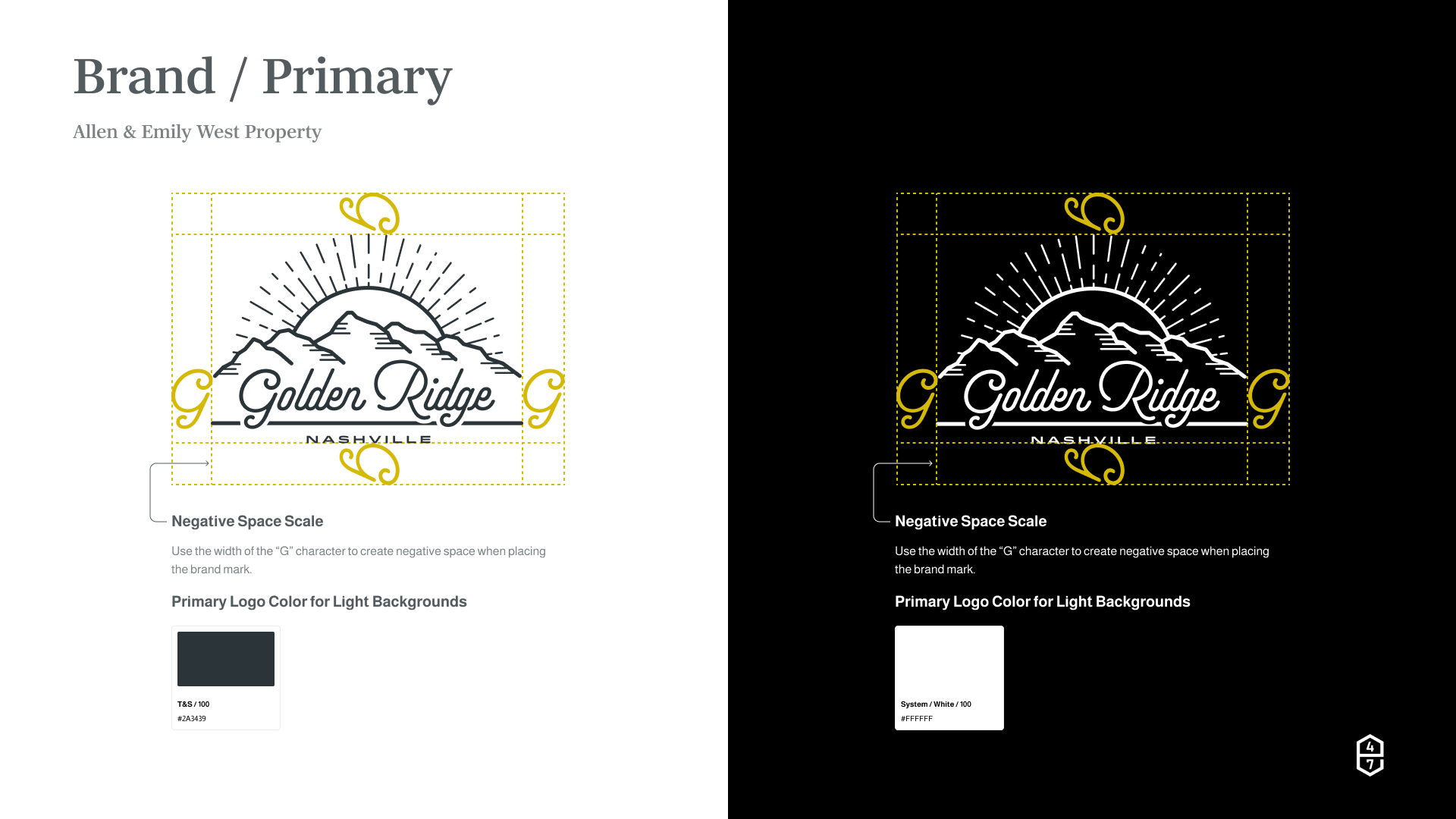
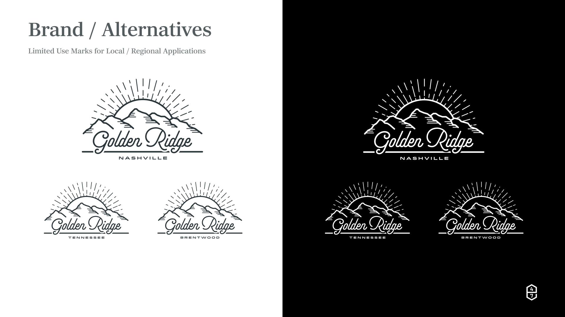
The identity needed to feel elevated without becoming overly luxurious or rustic. The goal was professionalism, clarity, and restraint—avoiding anything that felt kitschy, speculative, or themed. It needed to speak to all three buyer profiles.
Through interviews with the property owners and research into the land’s history and landscape, the name Golden Ridge emerged as a natural fit—referencing:
The surrounding ridgelines and elevation
Golden-hour light across the property
A sense of historical legacy, opportunity, and future potential
The final brand system balanced:
Clean lines, modern design paired with appropriate typography
A muted, nature-inspired color palette
Minimalist logo and wordmark usage
The site architecture was designed to support multiple buyer perspectives without fragmenting the experience. Key pages included:
Home
Land + Location
Amenities + Features
History
Potential
Gallery
Contact / Inquiry
Rather than explicitly labeling content by buyer type, the IA allowed users to naturally gravitate toward the information most relevant to their intent—whether that was acreage and development potential, lifestyle and legacy, or experiential opportunity. The wireframes were created to:
Establish content hierarchy
Align stakeholders on structure and scope
Serve as a foundation for copy and asset planning
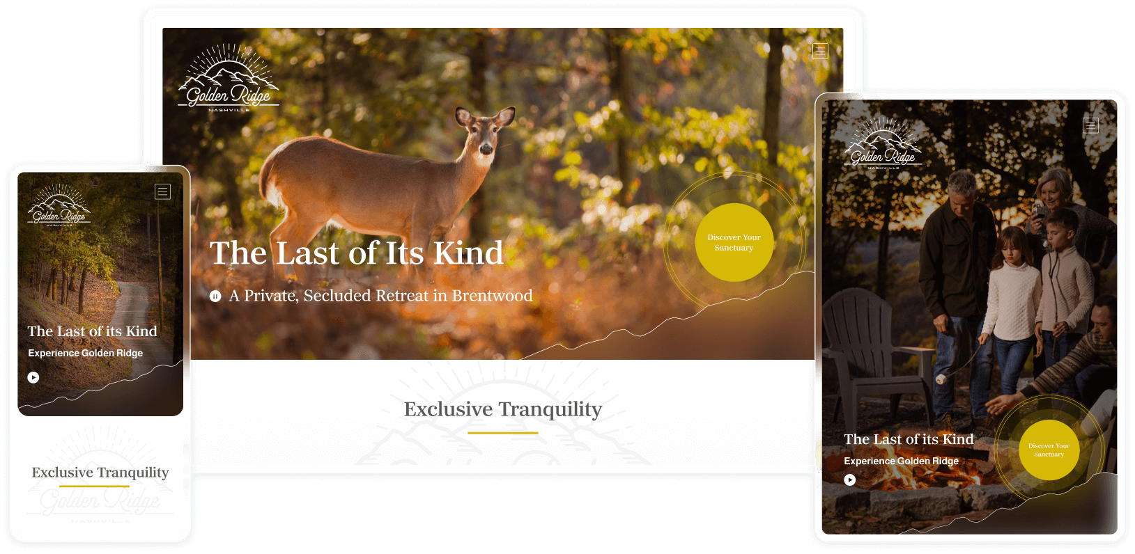
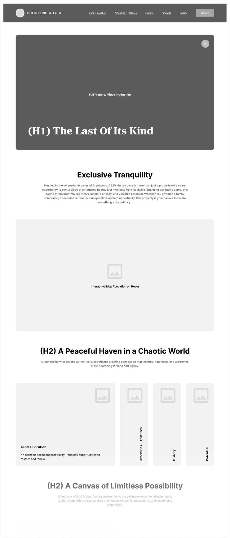
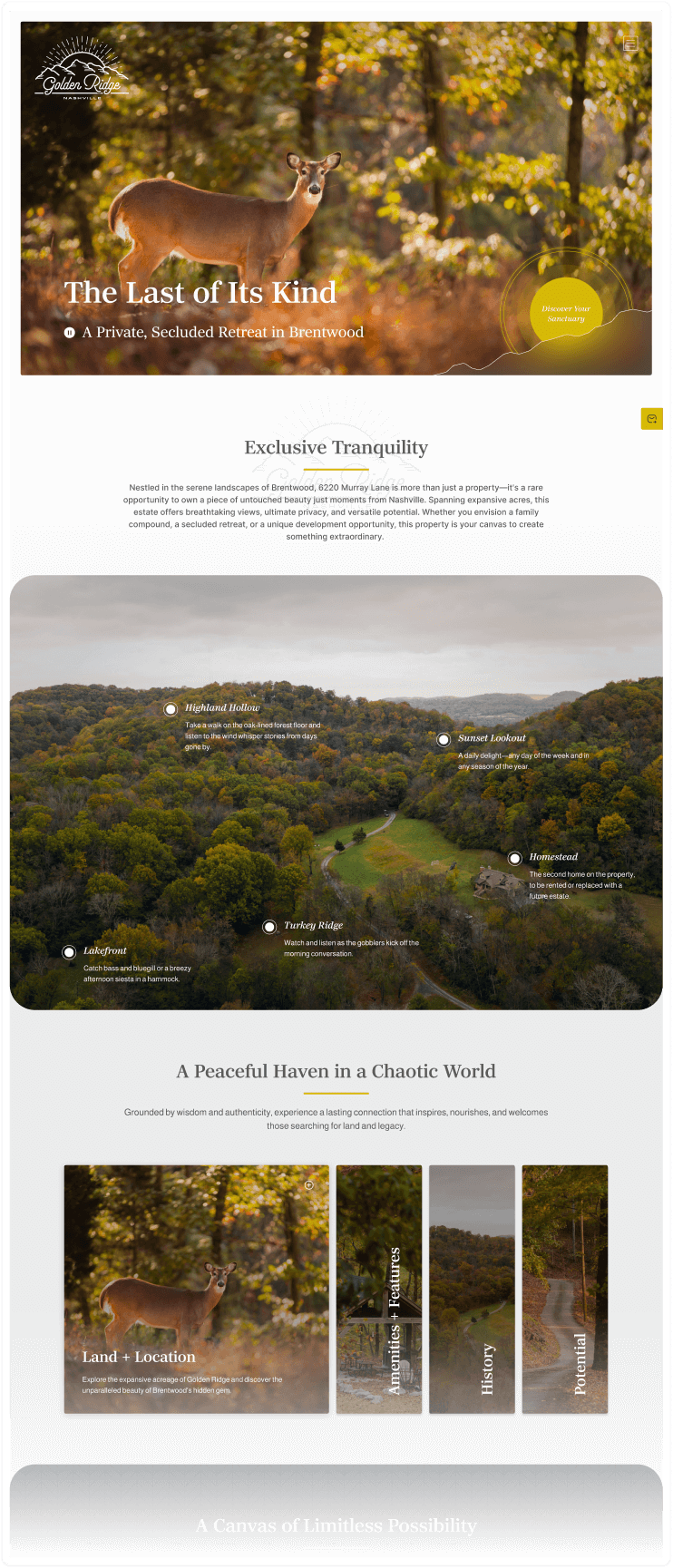
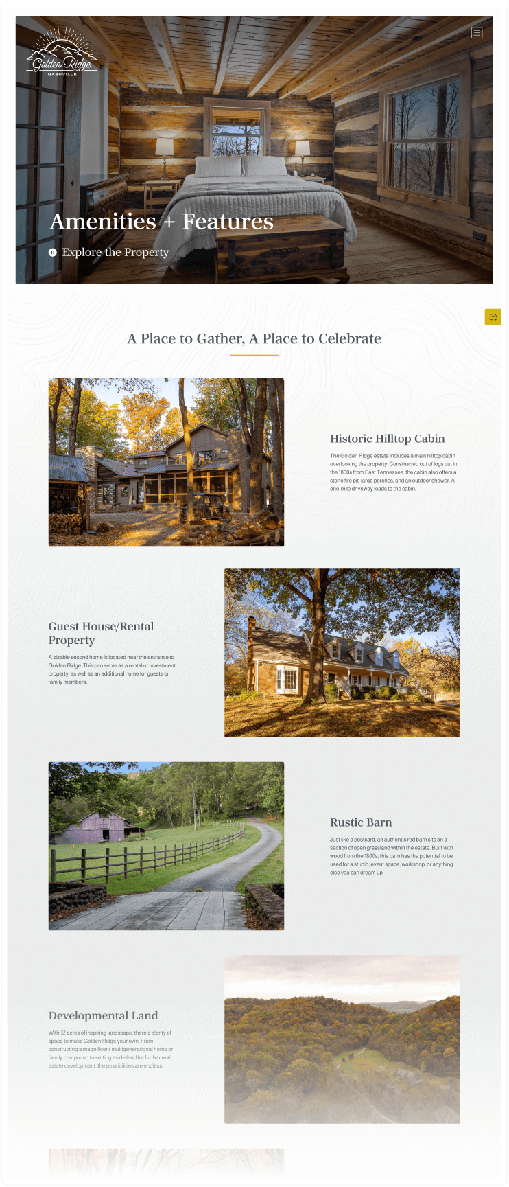
The visual design leaned heavily into scale, light, and atmosphere. Design principles included:
Scroll-based storytelling
Image-first layouts supported by restrained copy
Minimal interface chrome to keep focus on the land itself
Professional photography and drone footage were commissioned to capture:
Seasonal views
Topography and acreage
Wildlife, trails, and natural features
The final visual tone was intended to feel aspirational and open-ended—presenting the property as a canvas rather than a finished product.
To support our goals, we focused on optimizing high-level information crucial to the buyer types. The following top-level and interior pages were prioritized:
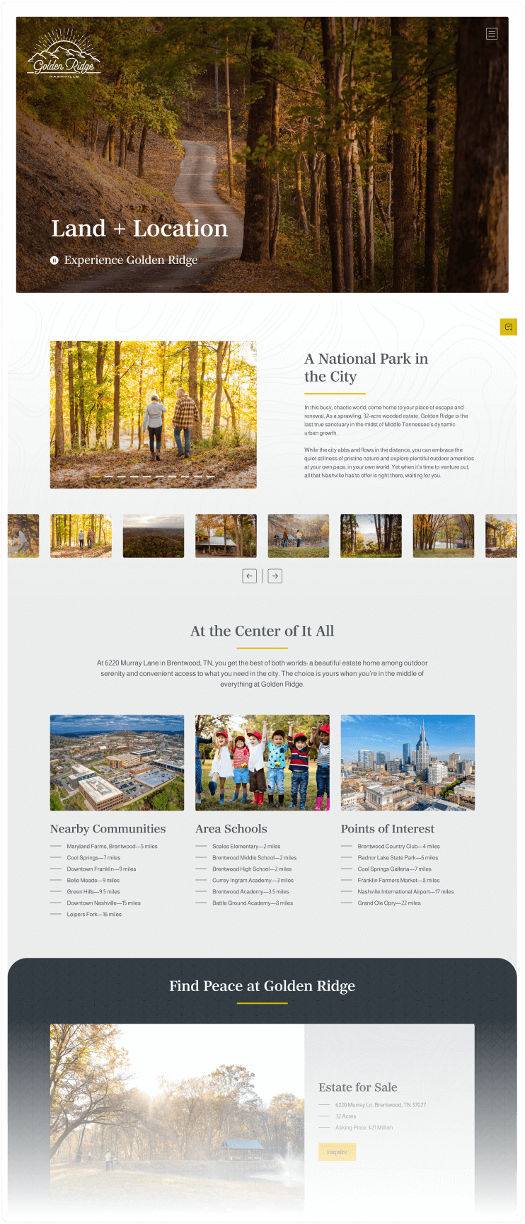
Land + Location: Features drone video and photography associated with the estate and surrounding areas
Amenities + Features: Showcases property highlights—wide aerial views, historical features, homesteads and area wildlife viewing opportunities
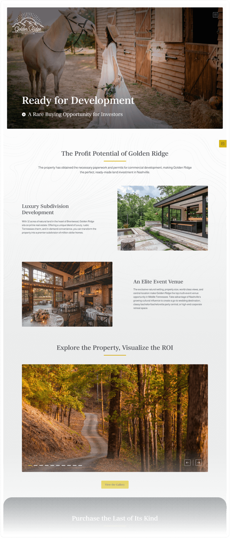
Development Opportunities: Information and imagery directly related to buyers interested in commercial land development and event venue opportunities
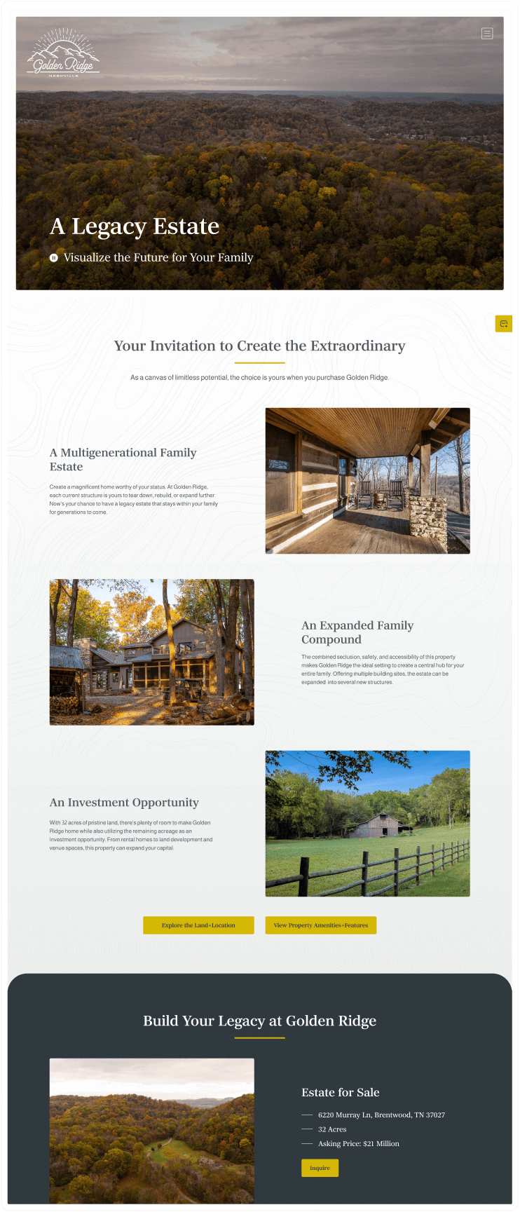
Legacy Family Estate: Visuals and information that would appeal to a buyer looking for an opportunity to purchase land and create a long-term family acreage
Each page section was intentionally structured to support:
Custom hero section 10-15 second video reels to highlight page features
The idea of high-value living, sanctuary and privacy within the Nashville area
Future estate vision and opportunities for all buyer types
A fast path to contact the sellers directly for more information
I collaborated closely with several internal and external administrative and production teams. These included:
Real estate brokers
External photographers and drone pilots
A contract content writer
Internal project management and development teams
As timelines tightened toward the end of the engagement, the project transitioned into a design-only handoff. High-fidelity designs and brand assets were prepared for development, though the site did not progress to build.
In hindsight, the scope and complexity of the project would have benefited from a more direct build approach (e.g., Webflow) to reduce translation overhead and maintain momentum.
Ultimately, we did not ship this project. There were some unfortunate circumstances that occurred as a result of ambiguity and budget constraints.
Golden Ridge reflects the kind of work I aim to do more of: projects that sit at the intersection of brand, UX, and strategy, where design is used not just to decorate, but to clarify value, shape perception, and guide decision-making.
As mentioned, the site didn't ship, but there were some valuable takeaways and lessons I will carry forward.
I produced the following:
A complete brand identity system
A clearly articulated UX strategy
High-fidelity responsive designs ready for implementation
A cohesive narrative framework for positioning a high-value, single-property estate
The project stands as an example of delivering cohesive, elevated design under conditions of ambiguity and evolving constraints.
This project reinforced several lessons that now directly inform how I approach complex, high-stakes engagements:
Success criteria must be defined beyond deliverables, including feedback cadence, decision ownership, and response expectations
Production roadmaps are not just operational tools — they are critical for protecting creative momentum
Design leadership includes holding firm on process, especially when timelines compress or goals shift
High-value, emotional purchases require clarity as much as inspiration
While the project did not reach launch, it strengthened my ability to lead through ambiguity, align diverse stakeholder needs, and deliver thoughtful, strategic design under pressure.

